
BRONCOS UNIFORM CONCEPT
Rollover zoom in the final design allows for closer inspection of details
In early 2024, the Denver Broncos announced they would be moving away from their 1997 uniform concept. As one of the more egregious examples of outdated design elements (two-tone piping, a WordArt-esque wordmark, mismatched stripe transitions, etc), I was excited for the update. Over the coming months, leaks from inside the building started to paint a clearer view of what fans might expect from the new design. These rumors indicated:
The primary jerseys will be orange and feature mountains on the sleeves
There will be a white "snow-capped" helmet
There will be subtle reference to the elevation in the numbers
The number 5280 will be referred to in the concept
As someone who has watched a lot of Broncos football and visited Denver countless times, I set out to design my version of this uniform within the constraints of the leaks.
At a high level, I decided to use the color scheme and logo from the early Elway era uniform. The royal blue and orange combination have a classic, retro quality befitting the old-school-if-not-hipster outdoors town they represent, while having a true novelty amongst a crowd of uniforms that cannibalize each other across the league.

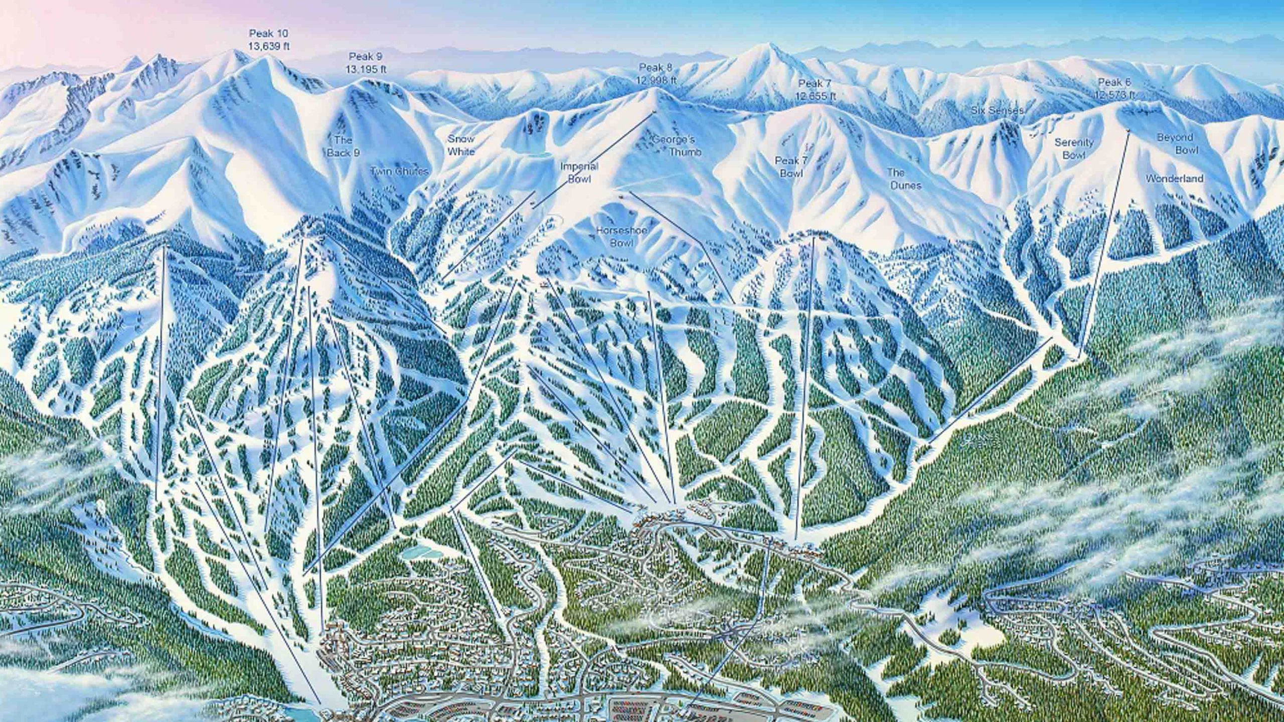
I found I could adapt the sleeve stripes from the 90s reference into the new design guidelines using mountains as the white portion of the stripe and the sky behind it as the blue part of the stripe. I wanted these mountains to do something no uniform has tried: incorporate realism into a uniform design. I chose to do this by referencing the outdoor sporting traditions of the area, crafting these mountains in the style of a James Nieheus (The Man Behind the Maps) ski map.
For the helmet, I liked the "snow-capped" leak, but I wanted it to be snowier than just a white hardshell. To this end I landed on the idea of using pearlescence and subtle shimmer to evoke the texture of fresh snowfall.

Moving on to the number font, I leaned into the wild west symbols found across the state. Borrowing from the signage often found in old mountain mining towns, I chose a font with an unmistakeable link to the cowboy culture of the region.

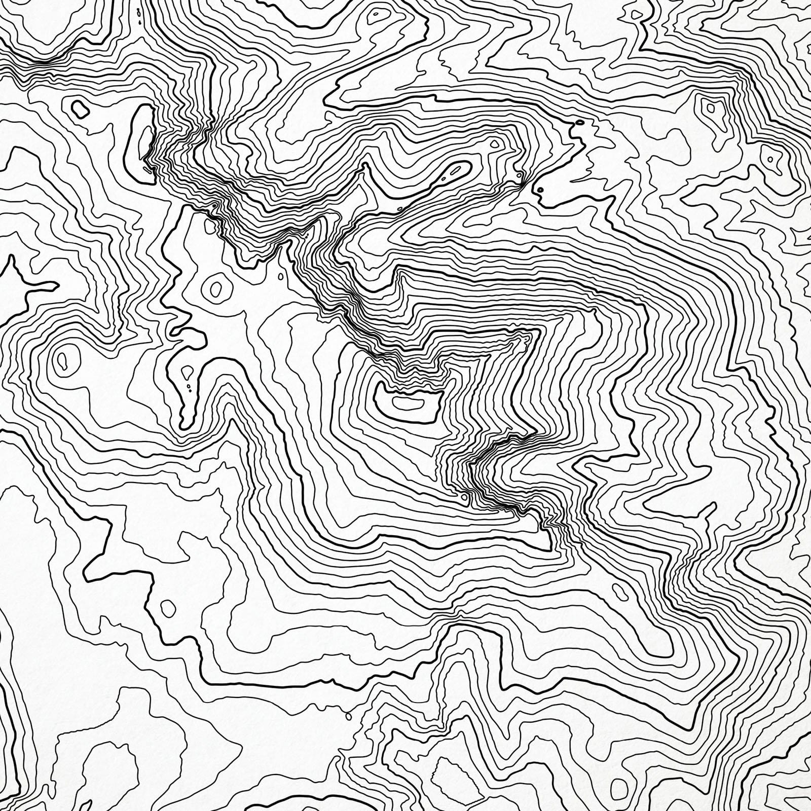
Within this final design element, I added the final constraint from the leaks: the reference to altitude. I represented this motif using topographical lines corresponding to Pikes Peak (the tallest peak in Colorado) patterned within the numbers.
Finally, to drive home where this team plays, I chose to put the words "Mile High" underneath the shield on the front of the jersey, a reference to Denver and the Broncos' stadium nicknames. I also added 5280 to the nameplate of the helmet, to bring the final look together. I think the final product is detailed, yet minimal. Unique and custom, but highly referential to the classic looks the franchise has worn before. Specific to the region without kitsch.
About one month after I made this design, the Broncos franchise released their official new look. For comparison, I've attached it below.
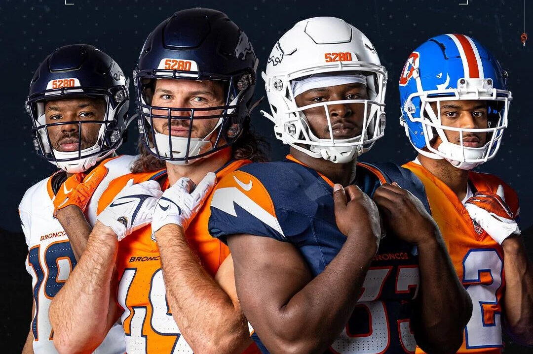
My honest take here is that the new look is fun. I like the matte helmets and number font, which feels like an updated version of their last font, as well as the 5280 on the helmet. I will admit that some of the elements disappoint me: The 90s bronco head isn't my favorite, and the mountains on the sleeves and "thin air" punchouts in the numbers are more subtle than I hoped for. The final product isn't bad, but it isn't as punchy as it could've been. That said, uniforms often take a few seasons to earn their standing within the brand identity of a team. We'll see how these ones age.